| Home |
| Join/Renew Online! |
| About NCMUG |
| Membership |
| Newsletter |
| Special Interest Groups |
| Mail Lists |
| Volunteering |
| Book Library |
| Member Sites |
| NCMUG FAQs |
| Mac FAQs |
| Contact Us |
| Site Map |

 Adobe
InDesign one on one
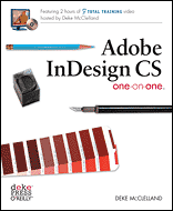
The cover of this book says, "Featuring 2 hours of Total Training
video hosted by Deke McClelland." True, there is a very good training
CD in the back of the book but I doubt that many people will go through
it in only two hours. The disc has so much information that, I think,
most people will want to play parts of it over and play it along with
reading the book and doing the lessons in the book.
Having reviewed other books by Deke McClelland, I decided to play the disc first and then go back and start the lessons and play the disc with them. Some things seem simple on the disc but when it comes to implementing them, one finds they are not as simple as once thought.
Deke's book goes into great detail and I'm learning things that I had overlooked up until now.
The book is mainly directed at people who have been using Quark Xpress. As I was a PageMaker user, some of the formats are not familiar to me but Deke explains everything in understandable terms. Having used InDesign CS for almost a year, I know most of the basic functions of the program.
The fine points are what I want to learn and this book is helping to make that possible. For instance, Chapter 8, Transparency and Effects, has many interesting aspects that are not in any other page layout program. The Transparency pallet is a Photoshop-like function that allows one to create transparent effects within InDesign or to import transparent art work from Photoshop. The author writes, "...only InDesign dares to operate outside the PostScript box and deliver partial transparency cross fades, drop shadows, and other translucency effects."
Chapter 9 goes into a lot of detail about the Pages pallet. The author again mentions that most of the InDesign users have been Quark users so the Adobe programmers made the Pages pallet look like Quark. He doesn't like the way it is configured and shows us how to change the set up as in Figure 1. I think he is right about this aspect as the way the Pages palette is set up there is a lot of wasted space on both sides of the page icons.
Deke uses his earlier book, Adobe Photoshop CS, as an example of how to use and set up pages, use master pages, create layers and use transparencies. I have that book too, so it was nice to be able to go back and forth between the two books.
Chapter 10 is the one that really grabbed my imagination. The chapter is called Working with Long Documents. In other words, perhaps a book. No, I haven't written a book but I just happen to have a short book or journal written by one of our members. (See sidebar.) I have used his book and photos to set up Paragraph Style, and other formatting modules to learn how to create a very long document. I don't think I will make an Index but if I wanted to, this book will explain how it should be done.
Reviewed by NCMUG member Janet Mobely
